One of the most exciting phases in the production of a new book is your first glimpse of the cover art, especially when your publisher uses the services of such a talent as Peter Fussey, who also created my covers for
11:59 and
Mr Stephenson's Regret.
Coming up with a brief for the artist can be tricky because the idea is not merely to create an attractive cover but to produce an image that will say something about the story inside and send some subtle sensory signals about the book as a whole. It's especially tricky for a psychological mystery, which the novel is, because you don't want inadvertently to provide a 'spoiler' with the choice of image, though you do hope to tease the reader's interest.
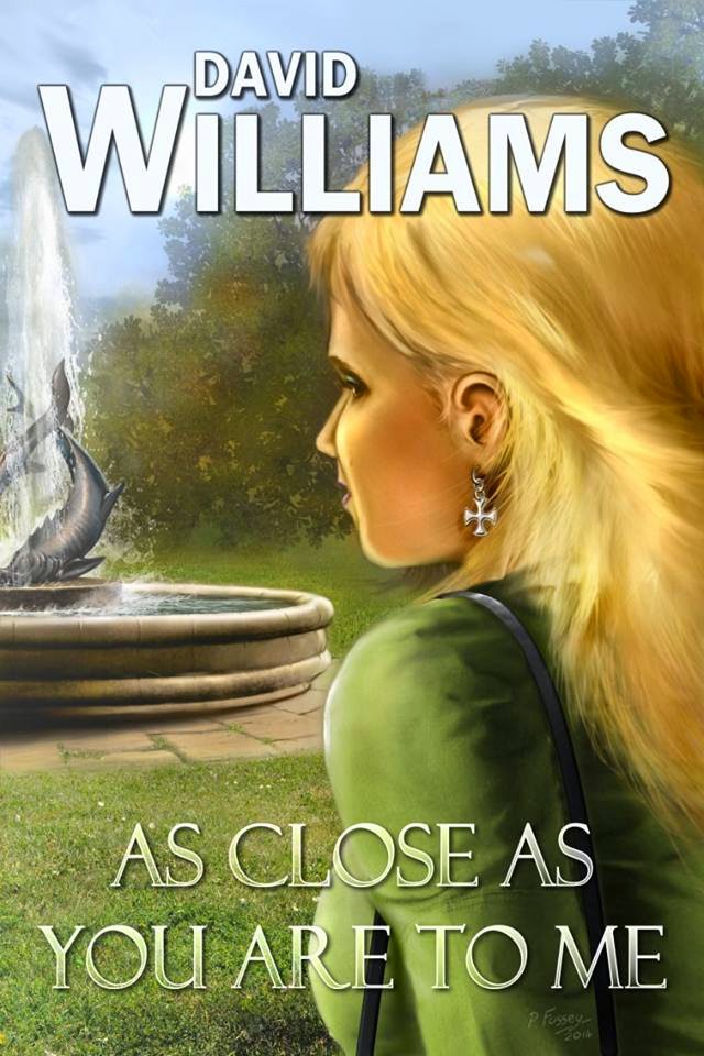
For this one I felt we should produce a telling image from the first scene in the novel, which is where the inciting incident lies. The central character Alex is in a city park, in a state of abstraction. He is brought to a sort of stunned consciousness by the appearance of his daughter walking alone through the park. Why the surprise? Ruth has been dead for over a year.
Here is the brief I gave to the artist:
I suggest the cover artwork refers to the first
scene in the book, where Alex sees 'Ruth' in the park, though the viewpoint I'm
proposing takes us closer to the girl than he would have been from his position
on the park.
An unseasonably warm early October day in the park.
We see in the foreground, as if we were just about able to reach out and touch
her, the head-and-shoulders back view of a young girl of 19-20 walking through
the park. We can tell she is attractive ('Swedish-looking'; think a young
Agnetha from ABBA) but we can see little of her face beyond a cheekbone and her
ear beneath her wispy blonde hair, lifted slightly by the breeze. She is
wearing a silver Maltese Cross earring with rounded edges on the cross-pieces
and a couple of short silver links, just enough for the earring to dangle
slightly. (No need to make the earring too obvious as long as it's there.) She
is wearing a simple green coat and we may just be able to see that she is carrying
a shouldered handbag with a single strap. She has a simple but elegant
affluence about her.
I'm not sure how much of the park we may be able to
see in the background, but if possible it would be good to see the suggestion
of a fountain in the distance (think Trafalgar Square fountain but very much scaled
down to city park size). In the story the girl runs her fingers through the
waters of the fountain as she passes, so the surface level would be at a height
for her to do that comfortably.
If it's difficult for perspective reasons to get
the fountain into the background I'm not too concerned - much more interested
in getting the girl right; she is very much the focus of the picture, and we
need to feel the presence of the unseen observer.
Peter concentrated first on the girl, and a few days ago sent me this sketch:
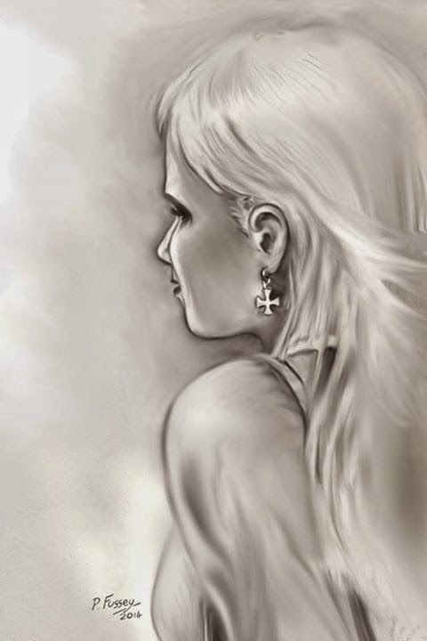
I was very pleased with it - very close to my mental image of 'Ruth'. The only concern I had for a while is that we see Ruth from the rear left. In my text the girl appears from the left of where Alex is sitting in the park, and just as she enters his peripheral vision makes a turn to her left and walks away from him. Following the logic of the text we should be seeing the girl from behind her right shoulder. Peter offered to 'flip' the image but as I reconsidered I realised it is better to have the image turned 'into' the cover rather than facing out of it. As it happens, I was checking the publisher's proof at this time. My solution? A minor redraft to have the girl entering from the right of Alex in he park. Some of you may consider me very anal retentive to insist the cover image follows the logic of the narrative exactly, and of course I am aware that 99% of readers would never notice this detail, but it would bother me forever.
Peter has now almost finalised the image and has sent me this near-complete version to check
I really like this and hope the readers will too. Peter told me he planned to add some people around the fountain but I have asked him not to - I'm sure that would distract from our subject; as I said in my brief I really want the girl to be the focus of the composition.
The only concern I have now is where the title and author name will go. My previous Wild Wolf novels have had my name running over the top of the image and the title running across the bottom. That worked for the previous covers but I think we may need some extension of scenery here so that the name does not obscure the head of the girl. I've raised this with the artist and I'm sure he'll come up with a good solution.
So the proofs have been checked and the cover almost done. 'As Close As You Are To Me' is scheduled for publication by the end of October. We may be a week or so out but it will certainly be in the shops in good time for Christmas. I hope you have it on your list.